MoveMe
Mobile-first website to help plan
and manage the moving experience

Role
Product Designer
Team
Individual
Skills
User Research UX/UI Design Prototyping
Timeline
Q4 2024 - Q2 2025
Overview
Moving to a new place can be stressful
The challenge was to create a mobile-first website for moving to a new place. Whether someone is moving across the country or even across the street, moving can be stressful and overwhelming no matter the circumstances. How can we make the moving process easier to manage?
Process
Interviewed people to learn about their past and current moving experiences
I interviewed five adults who have recently moved or were in the process of moving to a new place. These interviews uncovered common pain points:
Stress of unplanned events
Sought moving assistance
Ideated solutions to discovered pain points and pinpointed a direction
"How might we help people plan their move?"
"How might we help people get the assistance they need during the moving process?"
I anchored brainstorming sessions around these questions and evaluated ideas based on best fit and feasibility. I decided to move forward with a website that enables users to plan, manage, and find moving services for their upcoming move.

Conducted a competitive analysis to identify offerings in the market
Information for planning checklists, labor assistance and equipment were standard offerings across all competitors but lacked user search refinement to find vendors that fit their individual criteria. There was an opportunity to create a product that provides users with customized solutions.

Competitive analysis
Defined features for the MVP
I conducted a second usability test to validate the improvements.
Explored designs through rapid wireframing and created mock ups
With the features decided, I identified key screens and created flows that guided me throughout wireframing. Keeping in mind that users may be stressed when using the product, I aimed to make the UI feel comfortable and easy to use.
I quickly moved to high fidelity mock ups after finalizing the design direction.


Usability Testing
Usability testing revealed areas that required improvement
Five users participated in the usability testing. While all users mentioned having a positive overall experience with the prototype, there were common issues that impeded the website's usability. The most critical pain points were:
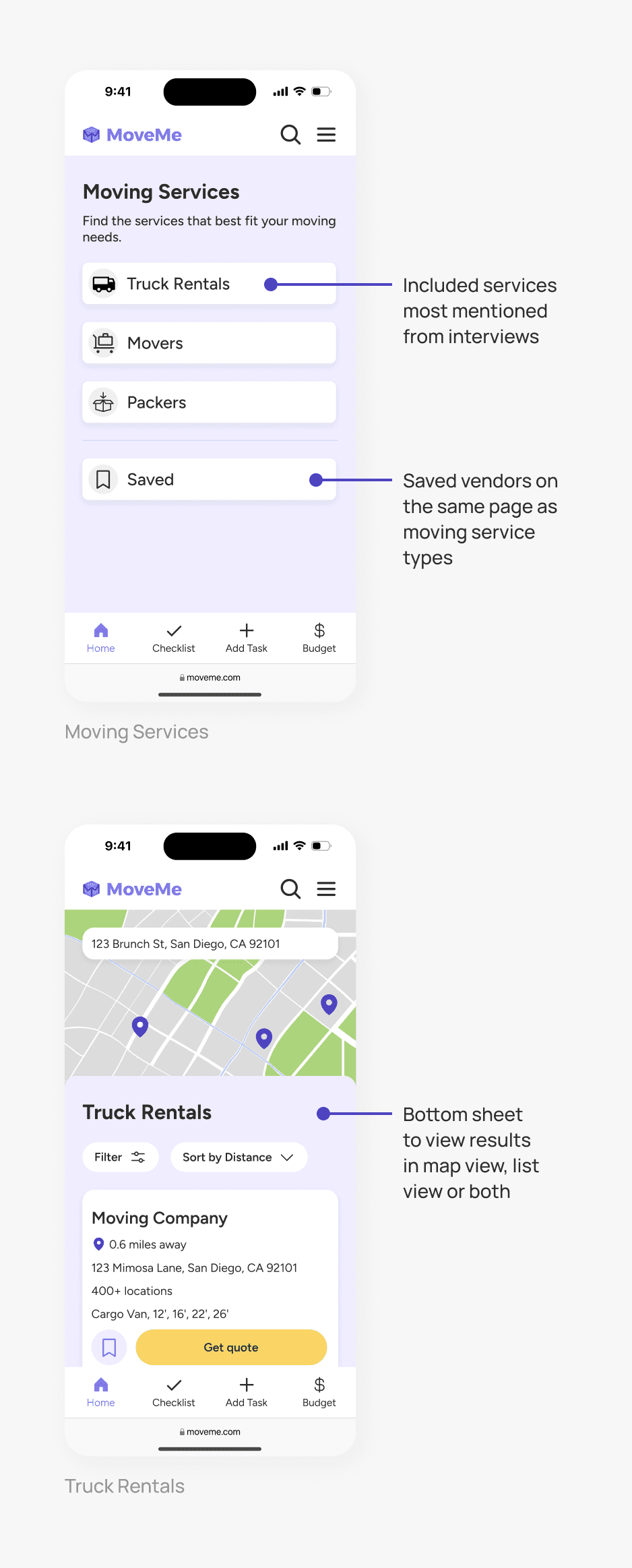
Clunky moving services layout
Users experienced friction from selecting a service type and browsing other services
Hard to find saved vendors
Users expected to find saved vendors in the user profile or menu, similar to social media apps
Choice overload when adding task
Users overwhelmed by multiple input fields but appreciated the ability to add more details
Final Design
Reworked the design based on feedback
I evaluated each task failure and pain point by their severity level along with the level of effort required to fix. I prioritized iterating on items with the highest severity levels since they impacted the user experience the most.
Exploring Moving Services
For a more streamlined browsing experience, I changed the layout to tabbed pages to allow users to immediately view vendors and quickly navigate between the different moving services.

Before and after of the moving services page
Find Saved Moving Services
I added a profile button on the bottom navigation and moved saved moving services within the profile for user familiarity. I opted to house it in the profile instead of the menu because the profile button is in the thumb zone and would be easier to access.

Before and after of finding saved moving services
Add Task
I simplified the page by only displaying the task input field on default and hid the optional input fields. Users can choose to show and use the additional fields if desired.

Before and after of adding a task
Testing the Updated Design
I conducted a second usability test to validate that users had an improved user experience with the updated designs. Users were better able to navigate between each screen with less errors compared to the first usability test.
Reflection
This project was a great learning experience
In retrospect, I would have benefited from more extensive design exploration early in the process as it would have helped me better evaluate and decide on the best path forward. The usability testing also reemphasized the fact that users' learned patterns and mental models shape their expectations and interactions with new and unfamiliar products.