SF Recreation & Parks

Role
Product Designer
Team
Individual
Skills
UX Research UX/UI Design Prototyping
Timeline
8 weeks
Overview
The San Francisco Recreation & Parks website services a broad and diverse audience
People who use the website include those who are seeking park information, recreational activities, event schedules, and reservation services. Despite its importance as a public service platform, users have difficulty navigating the site and finding relevant information efficiently.
This project aims to redesign part of the mobile and desktop website to better support users’ needs through improved usability, accessibility, and information architecture.
BACKGROUND
The website is overwhelming & not user-friendly
When I was first interested in playing tennis, I learned I had to make a reservation on the SF Rec & Parks website for the courts nearby. Figuring out how to make that initial reservation was more difficult and took longer than anticipated. Did other people also have a similar experience using this site?
RESEARCH
Users had a hard time navigating the site
To better understand other people’s experiences with the website, I conducted user interviews and asked users to provide a live reaction to the website. I synthesized the information with an affinity map to identify insights and user needs.
Pain Points
Fragmented Information
Low scannability
Content is often displayed in blocks of text and long lists
Cognitive overload
A lot of information is usually displayed all at once
Affinity Map
Insights
Users want to see important information upfront such as location, hours, maps, directions
Navigating pages is difficult due to content density, terminology, and lack of visual hierarchy
Users want the steps to complete a task to be minimal
Users use their mobile phones to look up information

User Persona
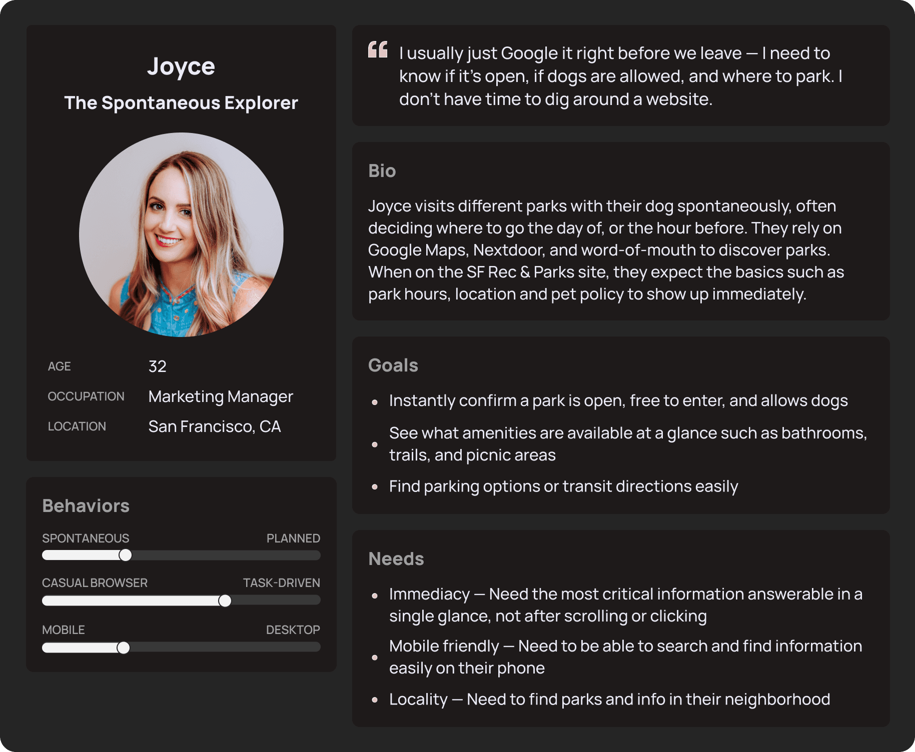
I created multiple user personas but decided to focus on Joyce “The Spontaneous Explorer” for this project. Joyce represents a large number of users who want to quickly get information on a park or facility using their phone.
How Might We
How might we make the mobile experience fast and navigable?
Process
Restructured the foundation to match users' mental models
Sitemap
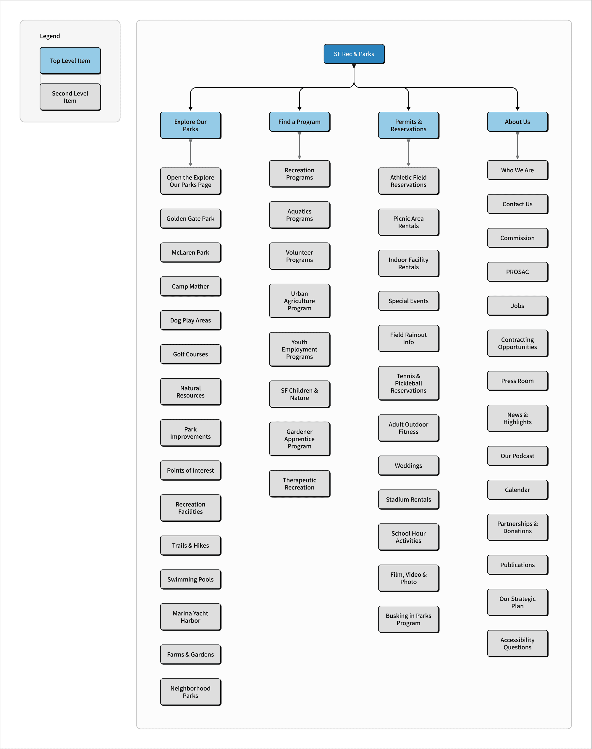
User interviews revealed the current sitemap was confusing. I iterated and created a new sitemap that has additional top level items and renamed navigation items to better represent the different kinds of information the website holds.
Task Flows
For this project, I decided to focus on two user journeys: finding a dog-friendly park and finding a tennis court to reserve.

Explorations
Ideating the best path forward
I brainstormed possible layouts for the pages needed for the task flows and weighed the pros and cons of each. After selecting a layout for each page, I moved on to mid-fidelity and high fidelity wireframing.

Usability Tests
Users needed more noticeable and straight-forward guidance
All participants responded positively to the prototype overall but there were still pain points that needed to be addressed:
75%
of users had trouble verifying if the park was dog-friendly on mobile
75%
of users didn't know where to begin searching for dog-friendly parks
50%
of users were confused by the default selected state of the map
Revisions
Updating the designs based on feedback
Making it easier to identify dog-friendly parks


Added a dynamic search to help guide users


Removed the pre-selected pin to reduce confusion


UI Kit
A more modern feel
Many users stated the website looked outdated, so I refreshed it to make it look a bit more modern. I updated the color palette to reflect more of a parks feel to the website.

Solution
Giving users a more efficient way to get what they need
Homepage
The redesigned homepage now uses the limited mobile screen space more efficiently and users don’t have to scroll as much to see everything on the homepage.

All Locations
This page lets users explore all the parks and facilities the San Francisco Rec & Parks has to offer. Users can see all the locations with a bird’s eye view on the map and view more details in the list.

Park Page
This page lets users explore all the parks and facilities the San Francisco Rec & Parks has to offer. Users can see all the locations with a bird’s eye view on the map and view more details in the list.

Search Results Page
The refreshed search results page is cleaner and gives users more information at a glance.

Tennis & Pickleball Page
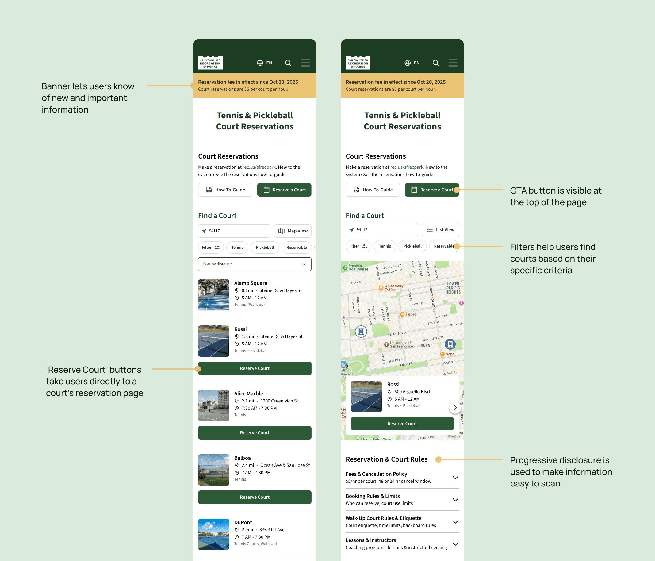
The court search functionality lets users find tennis and pickleball courts near them without having to search up courts in separate directory pages.
Prototype
Explore the prototype
WHAT I LEARNED
Reflection
Responsive websites are challenging
Designers need to plan and design for the different devices their users are using and how to best present information based on their device.Visual hierarchy and information architecture play big roles
Even if a website has all the necessary information on it, users can have a hard time finding and understanding that information without the right mix of visual hierarchy and information architecture.If I had more time, I would run another usability test
This would help me validate whether users find it easier to complete their tasks with the updated designs.