TiriVelo
Onboarding only supported dogs on an app meant for multiple pets

Role
Product Designer
TEAM
5 Designers
Scope
Sign up
Onboarding
Skills
UX/UI Design Prototyping
Timeline
6 weeks
Overview
TiriVelo wanted to polish the mobile app experience
TiriVelo is a pet care marketplace built on trust, care, and expertise, connecting pet owners with caregivers who can provide personalized care.
Our team joined to refine and strengthen the mobile user experience. We worked on several areas, but this case study will focus on my contribution of enhancing the pet owner account sign-up and onboarding experience.
Context
Where we started off
We were brought on in the midst of an ongoing project that had several design teams. A previous design team had already completed initial research and mobile designs. A separate team was finalizing the web designs. We had to quickly familiarize ourselves with the business and work that had already been done to start ours.
Research
The current onboarding was outdated and didn’t accommodate for other pets besides dogs
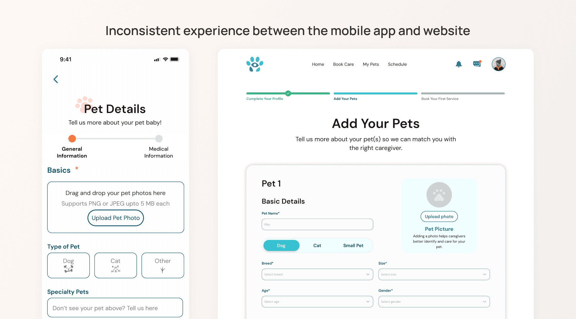
I reviewed the mobile app design files and also compared them with the web designs. The current user journey was a good foundation but I identified a few areas of improvement:
Conflicting content and visuals between the app and website
Pet profile flows missing for cats & small pets
Ambiguous progress indicators
Unstructured collection of medical information


The Challenge
How might we update the mobile experience to be consistent with the website, guide users clearly through profile creation for multiple pet types, and gather the information needed to match owners with the right care providers?
DESIGN
I redesigned sign up and onboarding around multiple pet types and the details providers need
Consistency between platforms
To keep the user experience consistent across platforms and within the app, I referenced the web designs for content and visuals and worked with my teammates to make the screens using our shared mobile design system.
Before: The visuals and content of the mobile app were inconsistent with the web experience.

After: The user journey is the same across platforms and visuals match TiriVelo’s updated look.

Adding other pet profiles
I added cat and small pet profile flows to allow TiriVelo to ask more in depth tailored questions for each pet type. While the cat profile was similar to the dog profile, the small pet profile flow had to have more customized questions.
Before: No flow for small pets. The initial pet selection screen allowed pet owners to list any animal in the 'Specialty Pets' input field.
After: I replaced the pet type text field with a drop down to limit the pet types and because we already utilized drop downs in other areas. This allows TiriVelo to recruit and manage providers with the right experience to care for those pet types. Owners can also create small pet group profiles for animals commonly raised in communities such as fish.

A consolidated progress bar
Before: Progress indicators were only present during pet profile creation, limiting user visibility in the overall onboarding process. In addition, the indicators were confusing since they were in two separate locations.
After: To align with the website, I updated the indicator functionality to show the overall onboarding journey. Since each onboarding section has multiple parts, I added incremental increases for each indicator step to show gradual progress.

Capturing important medication information
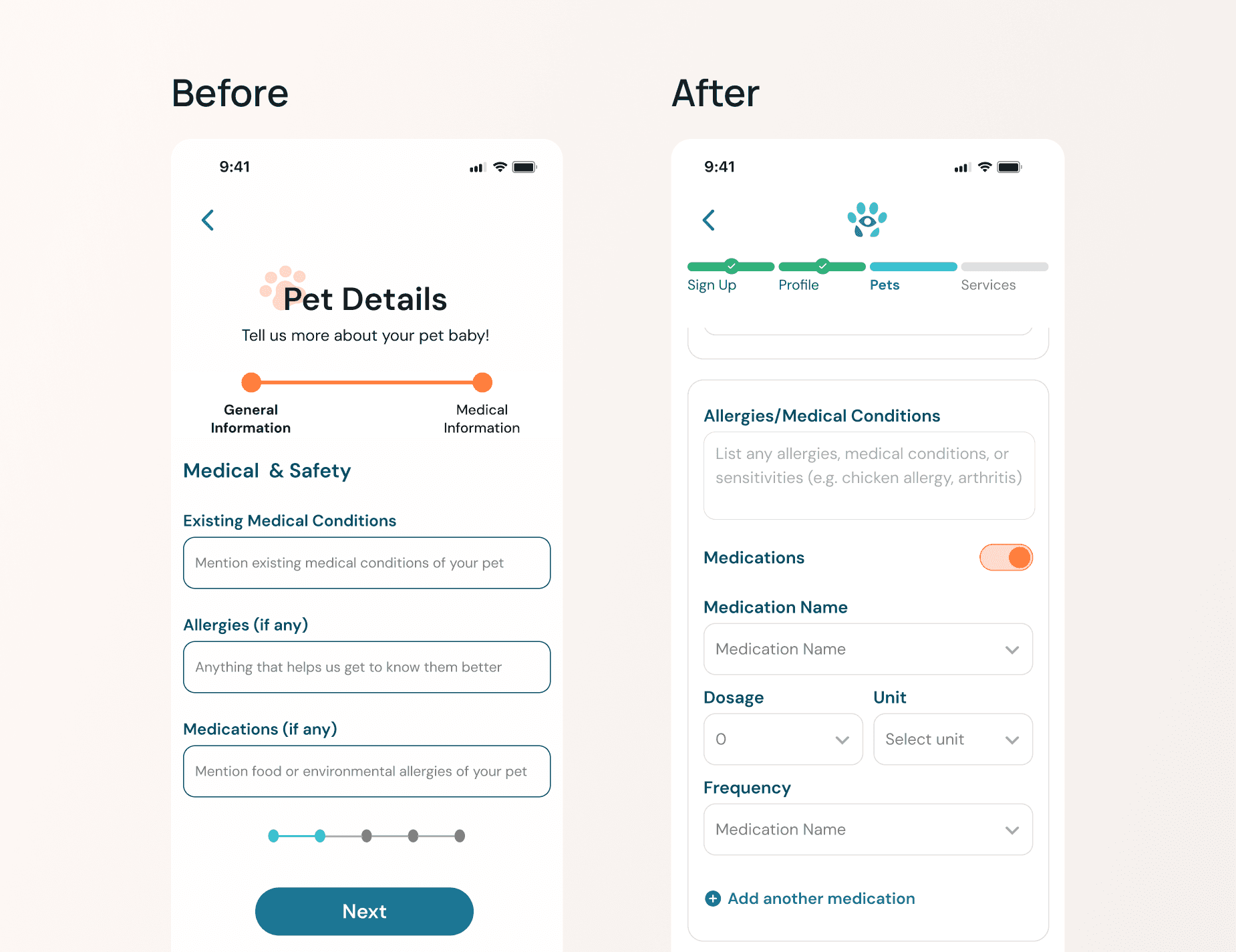
Before: Text field lets pet owners write anything in the medication field. This introduces unstructured data collection and the possibility of users not providing enough medical information if required.
After: I changed the medications section to drop downs to guide users on the information needed when entering medication information. This also limits the information entered and captured.
Constraints & Validation
The client deprioritized testing these flows
Due to a tight timeline and client prioritization of testing other flows, my designs were unvalidated. If I had more time, I would ask users to test the sign up and onboarding flow, with a task of adding a small pet group. I’d be able to test most of the changes I made and also gauge whether users understand the questions particular to that flow.
SOLUTION
An updated sign up and onboarding experience for understanding pet care needs
The design helps pet owners communicate what makes their pet unique and establish strong matches with providers.
My team and I put together our final screens and presented our work as overall user journeys for the pet owner and pet provider. The client mentioned that my contributions helped strengthen the overall direction of the mobile platform experience.

Prototype
Explore the prototype
See the pet owner sign up and onboarding in the prototype below. The guest search that occurs between sign up and onboarding was created by my teammate Alice!
Reflection
What I learned
Designing for and servicing multiple pets can get challenging
Each pet type has their own unique needs. Understanding and translating them into a pet profile flow requires lots of research. Additionally, limiting the pet types to be serviced on the app allows TiriVelo to focus on providing better matches for those pet types.Communication is vital in large design teams
While I worked on sign up and onboarding, my teammates worked on other workstreams. A design decision in one area can affect many parts within and across platforms. Communicating those changes are important to stay aligned and keep the user experience consistent.